
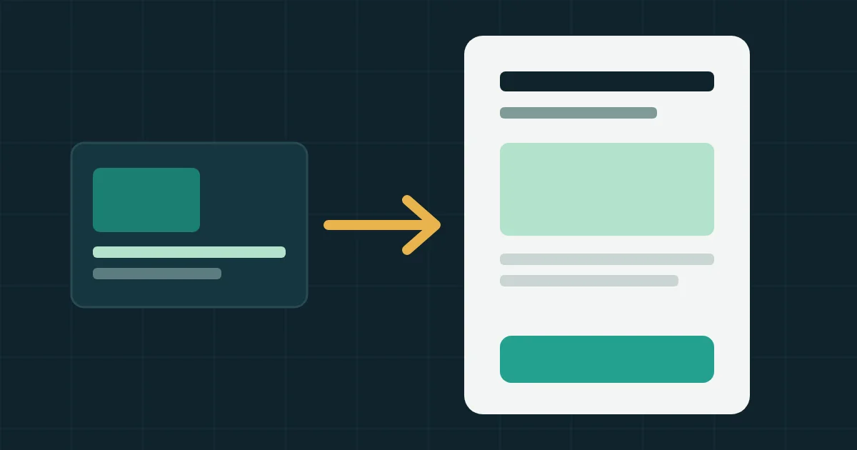
A landing page is a standalone web page people reach after clicking an ad, built around one goal such as sending a request, booking a call or buying a product. Your campaign needs one because the visitor clicked on a specific promise. If that promise is buried inside a general page full of menus, you have paid for a click that may lead nowhere.
This article covers when you need a landing page and when a form inside the ad platform is enough, which sections to include and in what order, and how to test each one. The table in the middle works as a review sheet for any page you already have.
How a landing page differs from the rest of your website
Your regular pages serve visitors with many different questions. A landing page serves one visitor who came from one ad, so it is built differently.
| Point | Home page | Landing page |
|---|---|---|
| Who arrives | People from many sources | People from one campaign |
| Goal | Introduce the company and route people | One clear action |
| Menus and links | Many, and needed | As few as possible |
| Copy | Covers every service | Continues the ad's promise |
| How you judge it | General traffic measures | Share of visitors who complete the action |
Your website still matters. A serious buyer opens it to confirm you are real before deciding, so a landing page works alongside your company website and does not replace it.
Why the page affects your ad results
The page changes campaign results in two ways. The obvious one is how many visitors complete the request. The less obvious one is how the ad platform itself rates the visit.
Google defines landing page experience as how relevant and useful your page is to people who click your ad, and says Ad Rank can take it into account along with other factors. Its help pages recommend that you pick a page that closely matches your ad and keywords, keep the most important information near the top, limit pop-ups and make the phone experience easy.
A hypothetical example shows what the rate does. A campaign brings 1,000 clicks. At a 2% request rate you get 20 requests, and at 4% you get 40 from the same budget, so your cost per request halves without any extra ad spend. Lead quality is a separate question, which we cover in why you get plenty of leads and few sales.
When you need a landing page and when you do not
Not every campaign needs a separate page. It depends on what the customer must know before taking the next step.
| Situation | Usually the right choice |
|---|---|
| A service people hesitate over and need explained, such as property, software or medical treatment | Landing page |
| A simple offer the ad explains fully, where you want quick requests from phones | Instant form on Facebook and Instagram |
| The decision starts with a question and your team replies quickly | An ad that opens a WhatsApp chat |
| A single product in your online store | The product page itself, improved |
| Several different services in one campaign | One page per service |
Instant forms are faster on a phone, though they can bring less serious requests because the person read nothing about you. Meta also offers a setup that combines instant forms and website forms in one campaign. If the choice is unclear, test both on a small budget and compare how many requests reached a sales stage. Counting requests alone will mislead you. Our guide to splitting a first ad budget helps you work out the minimum for each test.
Landing page sections in order, with a test for each
This order suits most service campaigns. The first three rows should appear on the first phone screen, before any scrolling.
| # | Section | What goes in it | The test |
|---|---|---|---|
| 1 | Headline | The ad's promise in similar words | Put the ad beside the page. Do they look like one thing? |
| 2 | Supporting line | Who this is for and what they get | Can a visitor tell in five seconds if it fits them? |
| 3 | Action button | A clear verb, such as "Book a consultation" or "Get a quote" | Does the visitor know what happens after the click? |
| 4 | What the customer receives | Specific points on the service, timing and steps | Can each point be measured or checked? |
| 5 | Proof | Real named client reviews, certificates, work photos | Would a stranger believe this evidence? |
| 6 | What happens next | Who will call, when, and what you need from them | Do you actually keep to the time you wrote? |
| 7 | Questions before deciding | The questions customers repeat to your sales team | Ask whoever answers the phone. Are these the real ones? |
| 8 | Form | The fewest fields that let you follow up | Do you use every field in the first call? |
The bigger the decision, the longer the page. A simple booking needs little, while a software contract needs more explanation and more evidence. Judge a page by whether it answers the visitor's questions before they request, whatever its length.
A hypothetical example of matching ad and page
A dental clinic advertises teeth whitening with the line "A whitening session at a clinic near you". A weak page opens with "Welcome to our clinic" and a list of ten services. A stronger page opens with "Teeth whitening at our Nasr City branch", then the session length, then before and after photos used with consent, then the booking button. The clinic and the service are the same in both. What changed is what the visitor sees first.
Speed, phones and measurement before the ads run
Open the page on a mid-range phone over mobile data, then test it in PageSpeed Insights. Google treats the largest element's load time as good at 2.5 seconds or less. You will find the fixes in our article on website speed.
Do not start the ads until a submitted request registers as a conversion in both the ad platform and your analytics. A practical way is to send the visitor to a separate thank-you page after submitting and tie the event to it, or to a confirmed submission. The full setup list is in our guide to measuring conversions.
The form collects personal data, so state why you collect it and link your privacy policy beside it. Egypt and Saudi Arabia both have personal data rules (Egypt's law and the Saudi law). This paragraph is not legal advice, so check what applies to your business with your adviser.
Mistakes that raise your cost per request without you noticing
- Sending every ad to the home page. The visitor came for one thing and now has to search for it.
- One page for many services. A general headline matches no specific ad.
- More than one goal on the page. Download the catalog, follow us, book a call. Pick one action and repeat its button.
- The full site menu at the top. Each extra link is an exit before the request.
- A form that asks for more than you need. For each field, ask whether knowing the answer now would change what you do.
- A promise in the ad that the page does not show. A discount or date from the ad belongs on the first screen.
- Requests nobody answers. The best page cannot make up for slow follow-up.
A checklist before launch
- The headline repeats the ad's promise.
- The button shows on the first phone screen.
- The service and area are clear within five seconds.
- Every piece of proof is real and you can back it up.
- You sent a test request from a phone and it reached the right person.
- The conversion appeared in the ad platform and in analytics.
- The thank-you page says what happens next and when.
- The privacy policy is linked from the form.
- You checked page speed on mobile in PageSpeed Insights.
Your next step
Open the last ad you ran, put it beside the page it leads to, and go through the table above. Write down the first section that fails its test and start there. Begin with changes on the first screen, since every visitor sees it.
If you have no suitable page yet, pick one service, write the promise for its ad, then build the page around that promise. For how the channels fit together, see digital marketing for companies. If you want someone to build the page and connect its measurement, that is part of PlanKit's web development and landing page service.